Why[1]: Designing The Stego Logo
Author: HR.Seo
I was asked to create a logo for the product Stego, a newly released Apptest.ai program for the Mac. Logos are an important piece of branding; they show a window into a company and for that it’s easy to overcomplicate them by adding too many elements. Juggling accurate meaning and the limitations of logo design is a known headache for designers who are responsible for creating what is often the first glimpse into a brand or product.
It’s difficult to update a logo once consumers have become accustomed to it, so careful consideration upfront is highly important. To start designing Stego’s logo, I began by organizing, researching, and building up my ideas, then I determined what was most important for Stego’s logo to include:
- The name and features of the product
- Consistency with the current Apptest.ai logo
- Reflection of company culture keywords
Dissecting and examining the names and features of the product was most necessary so I did that first. If the logo and the product are disconnected, users or customers can feel perplexed. If they see a sleek black and glossy logo, they’ll often expect a luxurious, sophisticated product. If they actually experience a multicolored and casual product, how would they feel? They’d probably develop some skepticism around the company. The logo’s shape and color can best express its essence when it is recomposed based on the disassembled characteristics.
1. Product name and features
Stego is one of the AI-based mobile app testing automation tools that our company has developed ambitiously. Until now, mobile app testing has been a rather repetitive and uncomfortable process of installing the app on the phone and manually operating the buttons one by one to check if there are any problems. Our products create solutions to replace this manual testing with AI testbots instead of humans, and one of them is Stego, a tool that allows you to easily capture a series of app Graphical User Interface (GUI) operation and easily record it as an “app testing macros” – we call them (test) scenarios which can be feeded to the test robot to perform.
The name Step Go was first proposed as a combination of Step, which refers to the way we capture and write scenarios step by step, and Go, which refers to running the created scenarios, or executing them like a macro. After several internal discussions, the simpler name Stego was born.
The central way to use the Stego program is to create a test by adding and changing steps sequentially. It also has the advantage of being convenient and simple – the AI automatically analyzes the app screen and allows you to drag and drop tests onto the UI, so even beginners who don’t know much about coding can quickly create scenarios.
Stego’s UI design, which I worked on in addition to the Stego logo, reflects the opinions of the developers who created it. I introduced a dark mode theme in consideration of tired eyes from long writing sessions, and worked to make the overall elements less angular and more comfortable.

In delving into Stego, I was able to summarize the design work into four main keywords: step, dark mode, simplicity, and angularity.
2. Consistency with the current Apptest.ai logo
Our company logo–designed by famous Hip-Hop artist, Jinyoung “Santa” Im– is composed of lines and shapes combined in a continuous one-stroke design, which creates a strong and memorable impression. Even though Stego has its own independent form separated from the brand, there should be some consistency for future scalability and considering the sales format or method of the product. Among various options, I decided to focus on using lines as a key element to maintain consistency, and finally, we could start shaping the design.

3. Reflect company culture keywords
Not all designs need to be trendy, but for digital natives who are surrounded by a lot of electronic media with sleepless hours, UIs that are too unfamiliar can feel alienating. Therefore, I decided that it was necessary to design a logo that reflects the core concept without being too excessive.
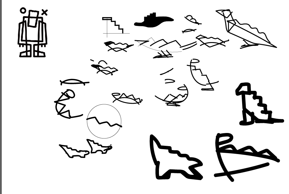
Two key design motifs I wanted to inherit from the Apptest.ai logo in order to keep consistency are “Mondrian-like bold lines” and “street art like touch”, both of which reflect a company culture that is not rigid but free-spirited. The friendly logo may help to relax the heavy tech savvy marketing with a casual encounter. I borrowed the image of my favorite dinosaur, stegosaurus, which is reminiscent of the name Stego, to create the icon.

Our “Stego,” which we brought to life by incorporating the insights and feedback from our developers, marketers, and executives through deep conversations, was launched last year and is now being used by many companies with positive feedback.
As a newcomer to society and a designer who delved deeply into a company’s product for the first time, the process was not easy as it involved many meetings that led to redoing and reworking. However, the satisfaction of seeing the results of my hard work being well-received in the market is more than enough to compensate for the difficulties of creation and leaves a great joy.
If you want to learn more about our work, we recommend trying out our product, Stego.


