Why: Designing the Stego Logo
Author : HR Seo
Creating a logo for Stego, Apptest.ai’s newly released AI-based mobile app testing automation tool, was an exciting yet challenging task. Logos play a crucial role in branding, offering the first visual impression of a product. However, it’s easy to overcomplicate them by adding too many elements. Striking the balance between visual simplicity and meaning is often the greatest challenge for designers, especially when it’s something as important as the first glimpse into a tech brand.
Importance of Logo Design in Product Branding
Logos are hard to change once consumers are familiar with them, which is why careful upfront planning is crucial. For Stego’s logo, I took time to organize, research, and reflect on what elements would best represent the product and brand. After thorough analysis, I identified three key areas:
- Reflecting company culture and values
- Incorporating the product’s name and features
- Maintaining consistency with Apptest.ai’s logo
1. Product Name and Features
Stego is one of Apptest.ai’s AI-driven mobile app testing tools, designed to simplify the app testing process. Traditionally, app testing required manual interaction with the app, installing it on a device and manually clicking through buttons to detect errors. Stego automates this by allowing users to capture Graphical User Interface (GUI) operations and record them as “app testing macros.” These test scenarios can then be executed by our AI testbots.
The name “Stego” originated from “Step Go,” a combination of the words “step” (representing the sequential capturing of test steps) and “go” (referring to executing the created test scenarios). After internal discussions, we opted for the simpler and catchier name, Stego.
Stego’s UI is designed to be intuitive. It enables users to easily add or modify steps in a test, leveraging AI to analyze app screens and facilitate drag-and-drop testing, making it accessible even to those without coding knowledge.
In designing the UI and logo, I emphasized user comfort. I introduced a dark mode theme to reduce eye strain and ensured that the design elements were simple and less angular, reflecting the ease and accessibility of Stego.
2. Consistency with Apptest.ai’s Logo
Apptest.ai’s logo, created by well-known Hip-Hop artist Jinyoung “Santa” Im, features a continuous one-stroke design, symbolizing fluidity and strength. Although Stego has a distinct identity, I wanted to ensure some level of visual continuity for brand scalability. After exploring several design concepts, I focused on incorporating bold lines into Stego’s logo, echoing the Apptest.ai style. This would ensure cohesion in our branding strategy, particularly for marketing and sales materials.
3. Reflecting Company Culture in the Logo
Designs should reflect the essence of the product and company culture without feeling forced or overly trendy. Apptest.ai’s culture is innovative and free-spirited, which I wanted to capture in the logo. The Apptest.ai logo’s Mondrian-inspired bold lines and street-art touch served as inspiration for Stego’s design, helping to maintain a casual yet professional tone.
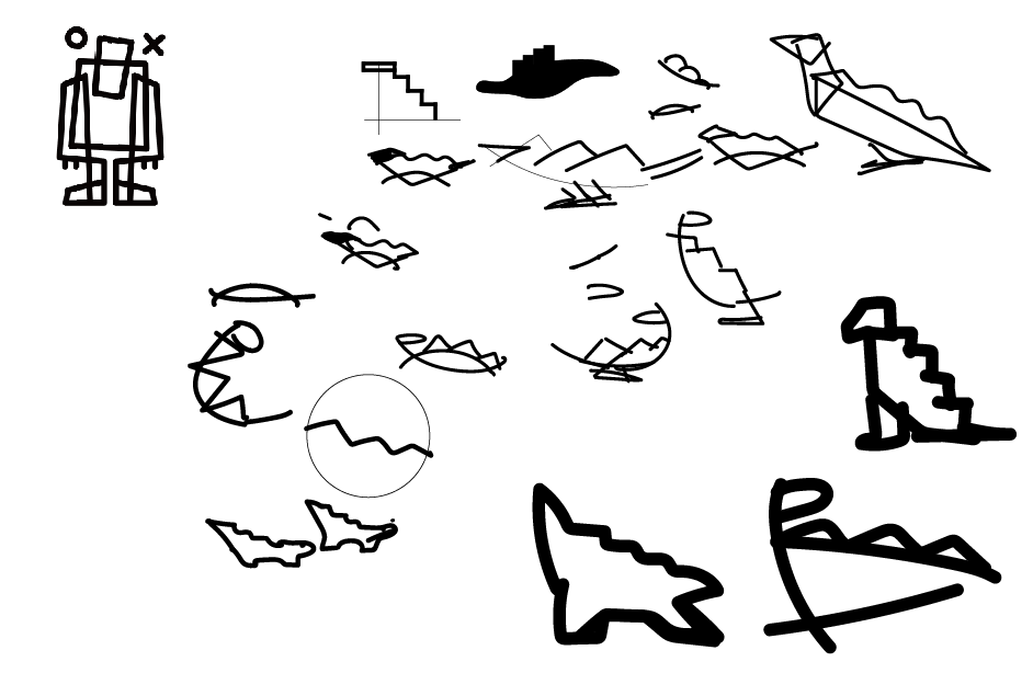
To further enhance Stego’s identity, I drew inspiration from my favorite dinosaur, the Stegosaurus, aligning the name with a playful yet strong motif. This blend of creativity and technology embodies our company culture, offering a friendly introduction to our otherwise highly technical product.
4. The Design Process and Final Launch
The Stego logo, born from deep collaboration with our developers, marketers, and executives, launched last year and has since received positive feedback from numerous companies that now use it.
As a designer new to the field, working on such a significant project was both challenging and rewarding. The process required numerous iterations and involved many collaborative meetings to refine the design. Despite the complexity and the occasional setbacks, seeing the final product resonate with users and contribute to the market has been incredibly fulfilling.
If you’re interested in seeing how our hard work translates into functionality, we invite you to explore Stego. “Streamline your app testing with Stego—simple, efficient, and intuitive.”